In the dynamic world of digital printing, achieving accurate colour reproduction is paramount to maintaining brand integrity and visual consistency. However, when it comes to translating Pantone colours to CMYK for digital printing, designers often encounter challenges associated with colour shifts. In this comprehensive guide, we'll explore the complexities of Pantone-to-CMYK conversion, understand the factors contributing to colour shifts, and learn practical strategies to mitigate discrepancies, ensuring vibrant and true-to-brand prints every time.
The Challenge of Pantone-to-CMYK Conversion
Pantone, with its standardized colour matching system, offers a comprehensive library of colours meticulously calibrated for precision and consistency. However, in digital printing, where CMYK (Cyan, Magenta, Yellow, Black) is the primary colour model, achieving perfect colour fidelity poses a significant challenge. The inherent differences between the Pantone and CMYK colour spaces often result in colour shifts during conversion, leading to discrepancies between the intended and printed colours.
Factors Contributing to Colour Shifts:
- Gamut Limitations: The Pantone colour gamut, defined by its extensive range of standardized colours, often exceeds the gamut achievable with CMYK inks. As a result, certain Pantone colours may fall outside the printable range of CMYK, necessitating colour adjustments during conversion.
- Ink Substitution: CMYK printers rely on a limited set of process inks to replicate a wide spectrum of colours, often necessitating the substitution of Pantone spot colours with their closest CMYK equivalents. However, these substitutions may result in perceptible differences in hue, saturation, and brightness.
- Colour Rendering Intent: Different colour rendering intents, such as perceptual and relative colourimetric, refers to how a digital system decides to convert colours from one colour space to another, like Pantone to CMYK, when a perfect match isn’t possible. Pantone colours are spot colours with exact specifications. CMYK colours are made from blends of cyan, magenta, yellow, and black and are used in most printers. Now, when you try to print a Pantone colour in CMYK, the system must “translate” it. That’s where rendering intent comes in.
Types of rendering intents:
- Perceptual: This method tries to preserve the overall look and feel of the image, even if it shifts all the colours slightly. Great for photographs and natural-looking images.
- Relative Colourimetric: This keeps colours as accurate as possible for those that exist in both colour spaces, but may clip or ignore colours that can’t be matched.
Why it matters: Choosing the wrong rendering intent can make your printed colours look too dull, too bright, or just not true to your design. So, the rendering intent can dramatically affect colour accuracy and visual appearance.
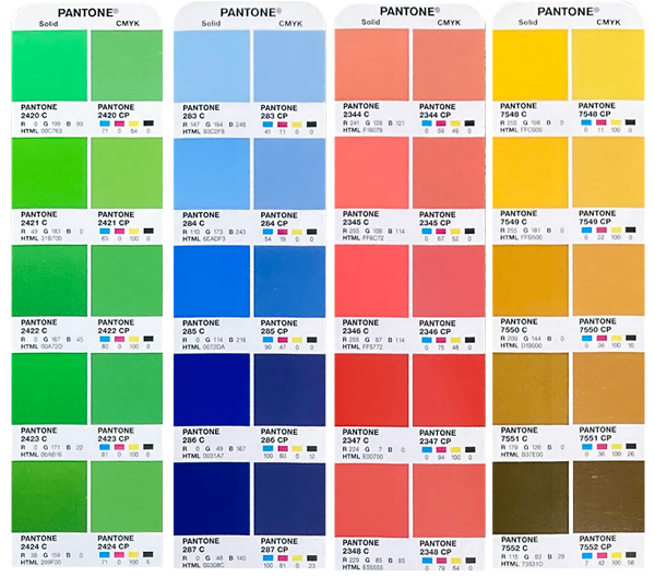
Colour shifts from PMS spot colour to CMYK process colour.
Strategies to Mitigate Colour Shifts
While achieving perfect colour match between Pantone and CMYK is elusive, employing strategic approaches can help minimize colour discrepancies and ensure satisfactory print results.
- Conduct Colour Testing: Prior to production, it's advisable to conduct colour testing to assess the accuracy of Pantone-to-CMYK conversion. Printing colour swatches or test proofs allows designers to evaluate colour fidelity under real-world printing conditions and identify any deviations from the intended colours.
- Optimize Colour Management: Implementing robust colour management practices is essential for maintaining consistency throughout the printing process. Calibrating printers, using standardized colour profiles, and employing colour management software can help ensure accurate colour reproduction and minimize variations between Pantone and CMYK colours.
- Adjust Pantone Selection: When selecting Pantone colours for digital printing, consider their compatibility with the CMYK colour gamut. Choosing Pantone colours that closely align with CMYK primaries can reduce the need for extensive colour adjustments during conversion, minimizing the risk of colour shifts.
- Collaborate with Printers: Engaging in open communication with printing professionals is invaluable for addressing colour-related concerns and optimizing print outcomes. Printers with expertise in digital colour management can offer valuable insights and recommendations for achieving optimal colour reproduction on CMYK devices.
- Make gradual improvements: To achieve accurate colours in digital printing, designers go through a process of testing and refining. By adjusting Pantone selections, updating colour profiles, and fine-tuning printer settings, they reduce colour shifts and improve overall consistency.
Pantone® announces the 2026 Colour of the Year!

Conclusion
Converting Pantone colours to CMYK in digital printing can be tricky. It takes a solid grasp of colour theory, an understanding of printing technologies, and smart strategies to deal with unexpected shifts. While perfect colour matches aren’t always possible, designers who stay proactive, use advanced colour management tools, and collaborate closely with print professionals can achieve bold, consistent results that stay true to the brand. So, when you kick off your next printing project, keep in mind that every colour reflects the careful work behind Pantone-to-CMYK conversion.
If you're aiming for standout results in your next digital print project, Southwest Business Products is your go-to partner. With an understanding of Pantone-to-CMYK conversions, digital print technology, and a collaborative approach, the Southwest team makes navigating the world of colour easier to manage. Stop guessing and start printing with confidence! Visit Southwest Business Products and let their expertise bring your designs to life.